

The point of no return
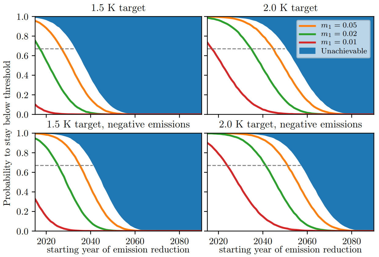
These plots from the study show the probability of staying below the 1.5°C (left) or 2°C (right) global-average temperature increases, set by the Paris Agreement.
The coloured curves represent the various emission-reduction scenarios, i.e., how quickly we would be able to reduce emissions by using more renewable energy: m[_1_] (red) indicates a scenario where we would be able to increase the share of renewable energy by 1% each year, m[_2_] (green) one where the share of renewable energy would increase by 2% each year, and m[_3_] (orange) one where the share of renewable energy would increase by 5% each year.
The top and bottom panels show the cases with and without strong negative emissions, respectively.
The 'point of no return' for a given emission-reductions policy is given by the point in time where the probability drops below a chosen threshold. The default threshold of two-thirds (67%) is dashed.
The unachievable region is bounded by the extreme mitigation scenario: one where we would be able to completely stop greenhouse gas emissions instantly.
Credit: Aengenheyster et al., Earth System Dynamics, 2018
Related EGU articles
Download
- Original image (151.4 KB, 1241.0x843.0 px)